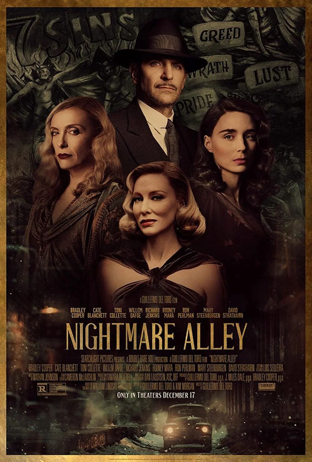
Nightmare Alley Fan Core Poster

It all started with an email…
I was fortunate enough to connect with Guillermo del Toro through Twitter back in 2016. Throughout the years, I've illustrated pieces inspired by his films, and he's added a few to his personal art collection. I've been an avid fan of his filmmaking and design language since I first saw "Pan's Labyrinth." Del Toro's storytelling taps into the sad and often dark parts of human nature. His characters unfold through a lens that romanticizes that struggle in an often fantastical way. It is a dark beauty that I've always found very appealing. So, when he emailed me asking if I wanted to do a movie poster for his upcoming film "Nightmare Alley," I cried for joy and couldn't sit still for an hour.
Early thumbnails exploring shapes.
I later had a call with the marketing director at Fox Searchlight and was given a concept from Del Toro. "Center figure with hat silhouetted by three misty female figures surrounding him. Half-lit face with one eye showing. Cool color palette." It was mentioned how Del Toro spoke about the character's fate, how each person makes their fate—something along those lines.
I was then told to run with it, so I did!

The Concept of Fate
The character Stanton, played by Bradley Cooper, is first introduced walking from a burning house. I felt it would be eloquent to have his character giving off dark smoke that would mingle with this misty background he was set against—further pushing the idea of their hazy fates intertwining. The three ghost-like women are Staton's love interests played by Cate Blanchett, Rooney Mara, and Toni Collette. I also wanted to make the womens' red lipstick pop. Red is often a critical symbol throughout Del Toro's films.
My concept sketches were approved, and I was given artistic freedom to create a piece unique to my style. I was very grateful to the marketing team.
Chalk Pastel to Digital
The illustration began as a black and white illustration created with chalk pastels on Arches BFK Rives paper. It was finished digitally with Photoshop, where I refined the character’s faces, colored the piece digitally, and added details. You can see some of the process below.
Process Work


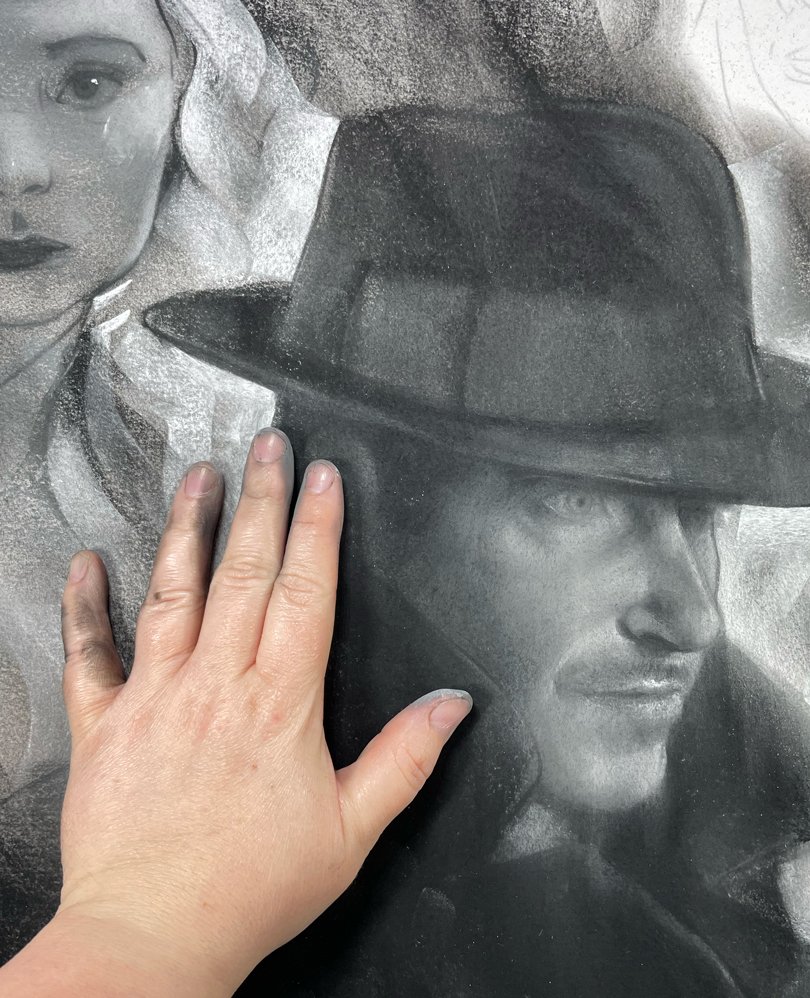
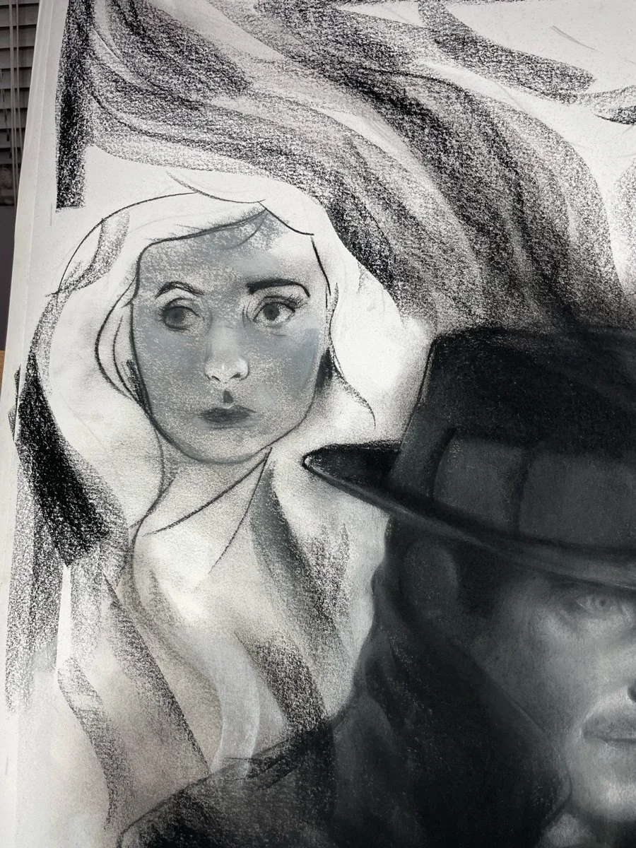


Close Ups


2 Color Options
I was given art direction to use cool colors. I decided to give FOX 2 different color pallets based on the film’s color scheme.
Blue
I feel this is one of GDT favorite color schemes. I’ve seen it before in “Crimson Peak” and “The Shape of Water.” Cool blue green colors with a high contrast spot of red.


“Dirty” Green
I pulled inspiration from the gritty nature of the film and used a more green tint. I also added black bit like soot floating around.

